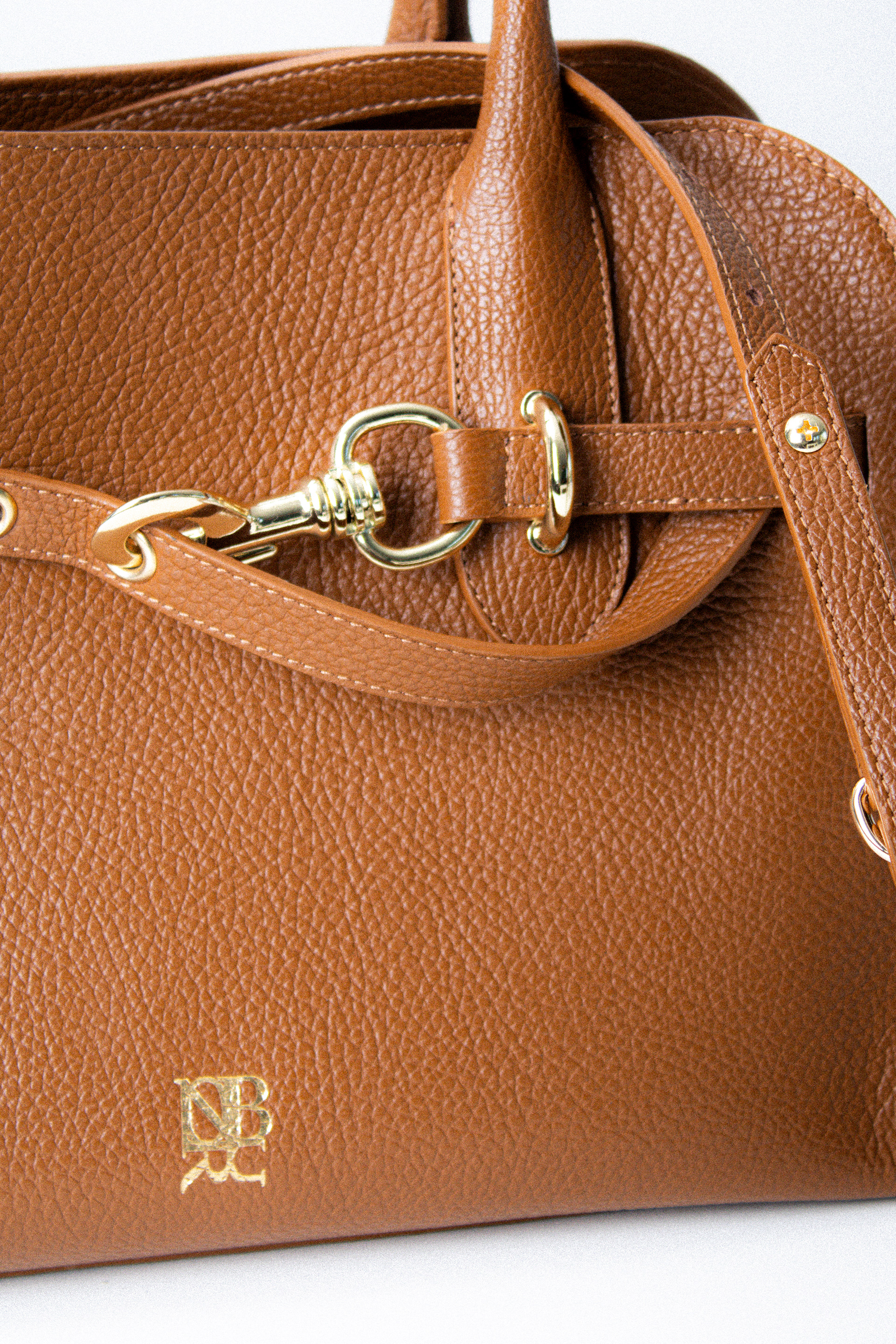
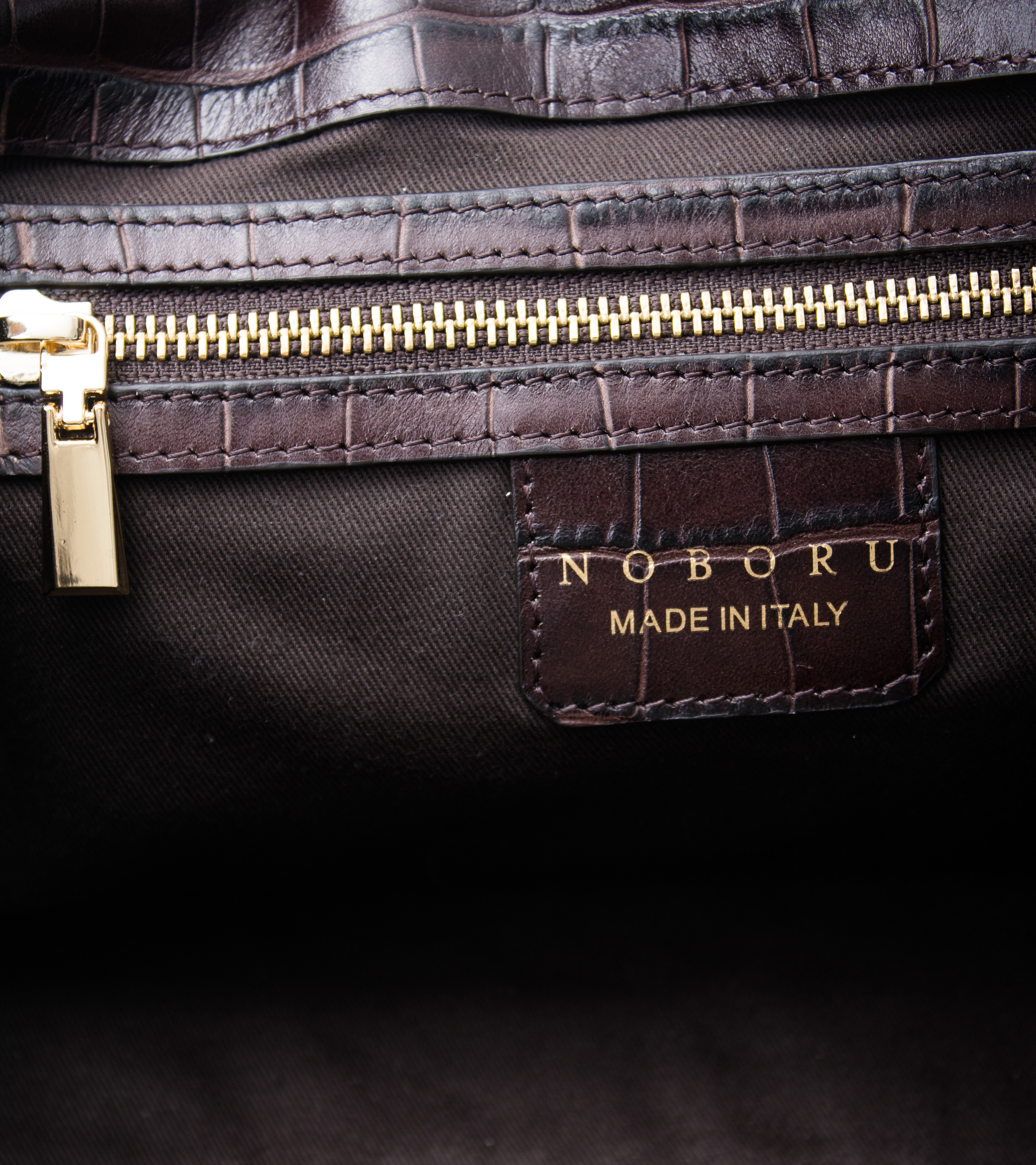
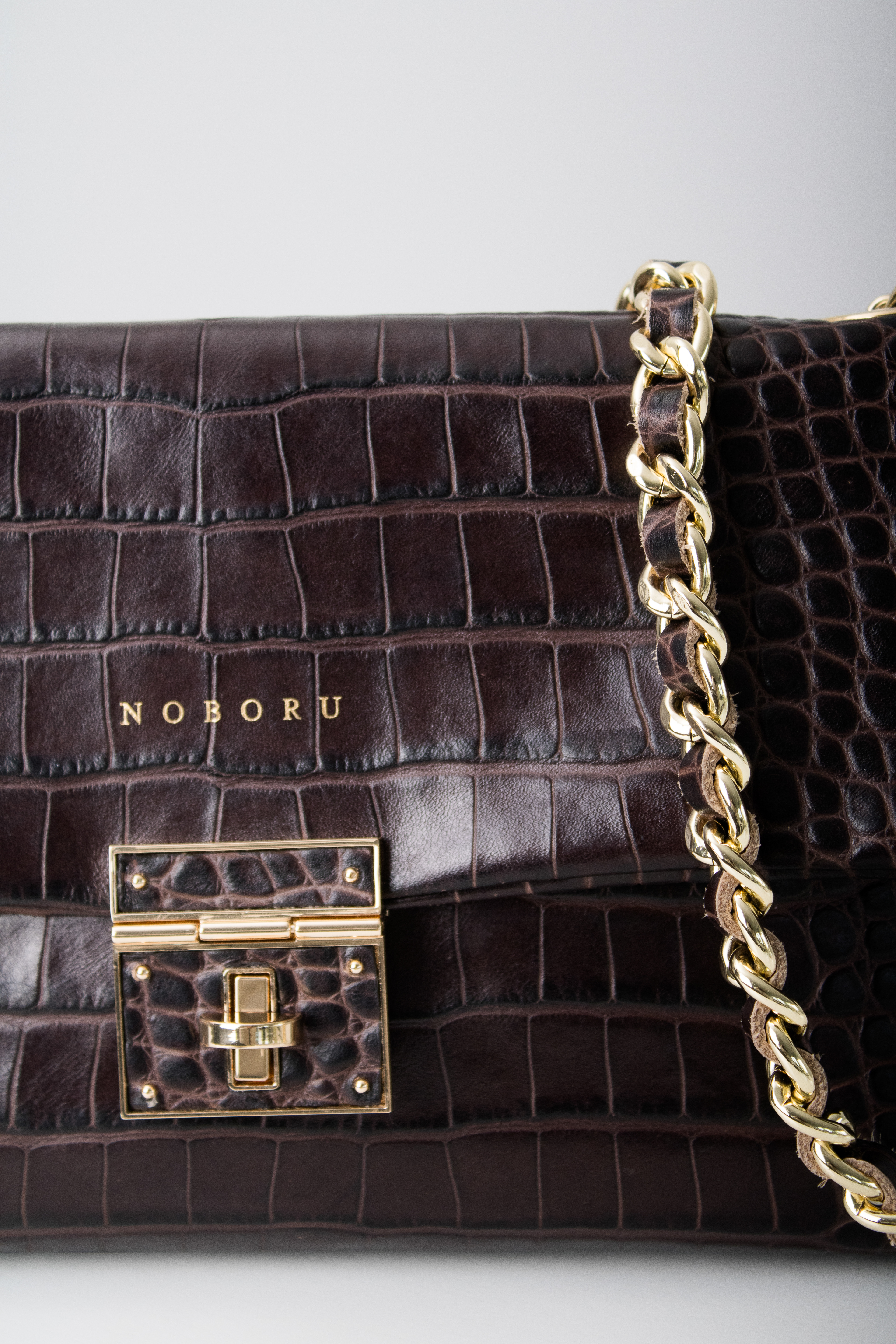
Noboru Bag Line (2025)
A brand currently in development, I have assisted with marketing, product photography and designing its logo for use on bags, merchandise and other Noboru products. Noboru means "to ascend" or "to climb" and was chosen from the owner's father's middle name. I wanted to illustrate a mountain logo to represent this meaning and choose a typeface that aligns with the client's parent business/company. Discussing the client's needs and expectations, I created different logo variants to explore illustration versus text to find an option that would suit best.

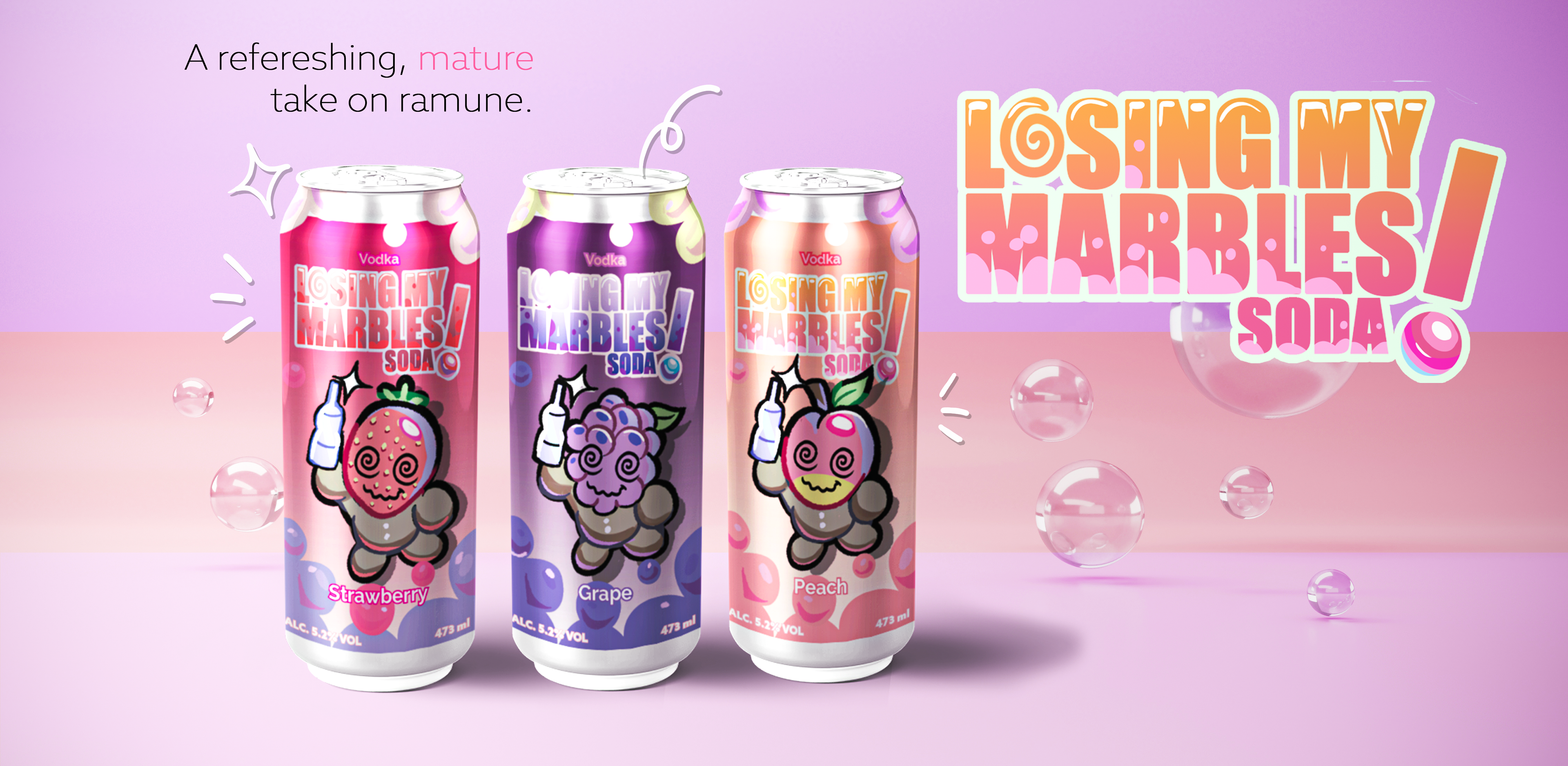
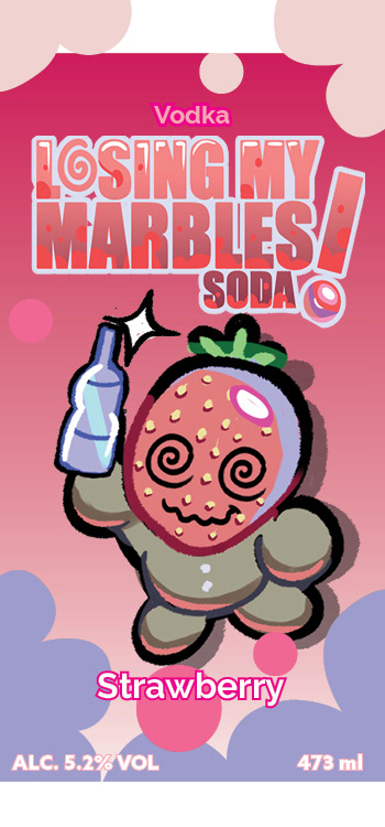
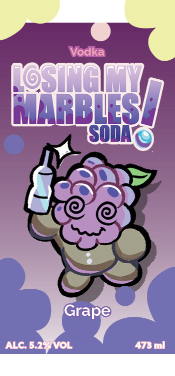
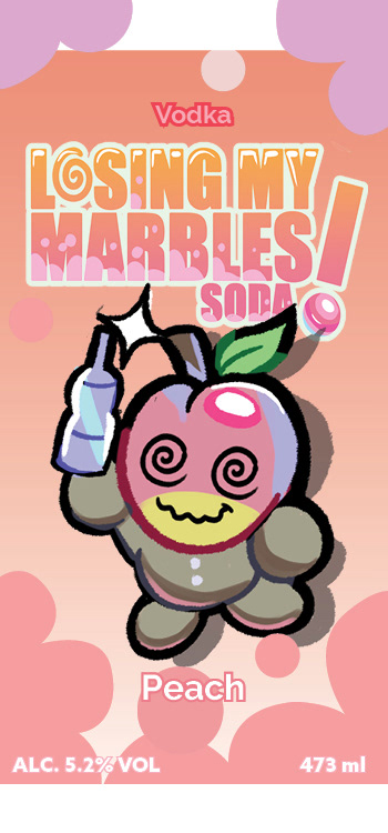
Beverage Can Design (2024)
A mockup beverage brand I created titled "Losing My Marbles!" based on Japanese drink influences like ramune. I wanted to play with colours, character design, and creating a brand visual with characters that can be altered for each flavour while remaining recognizable.
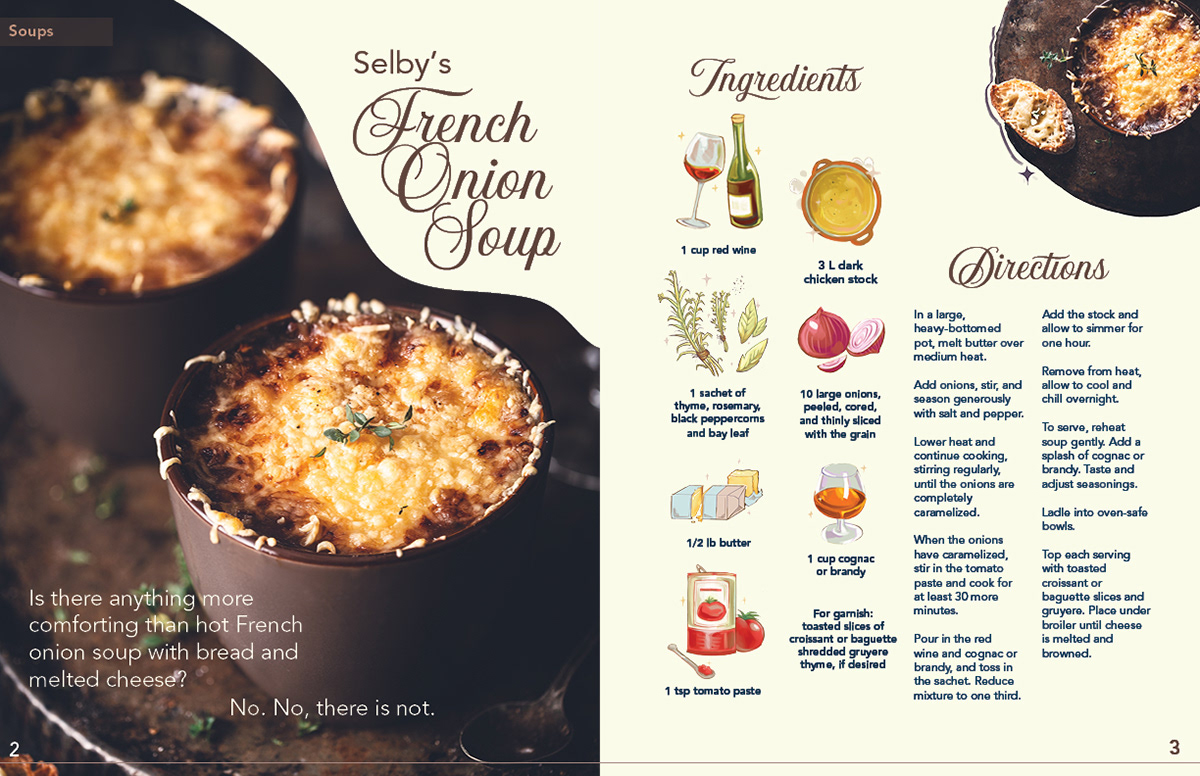
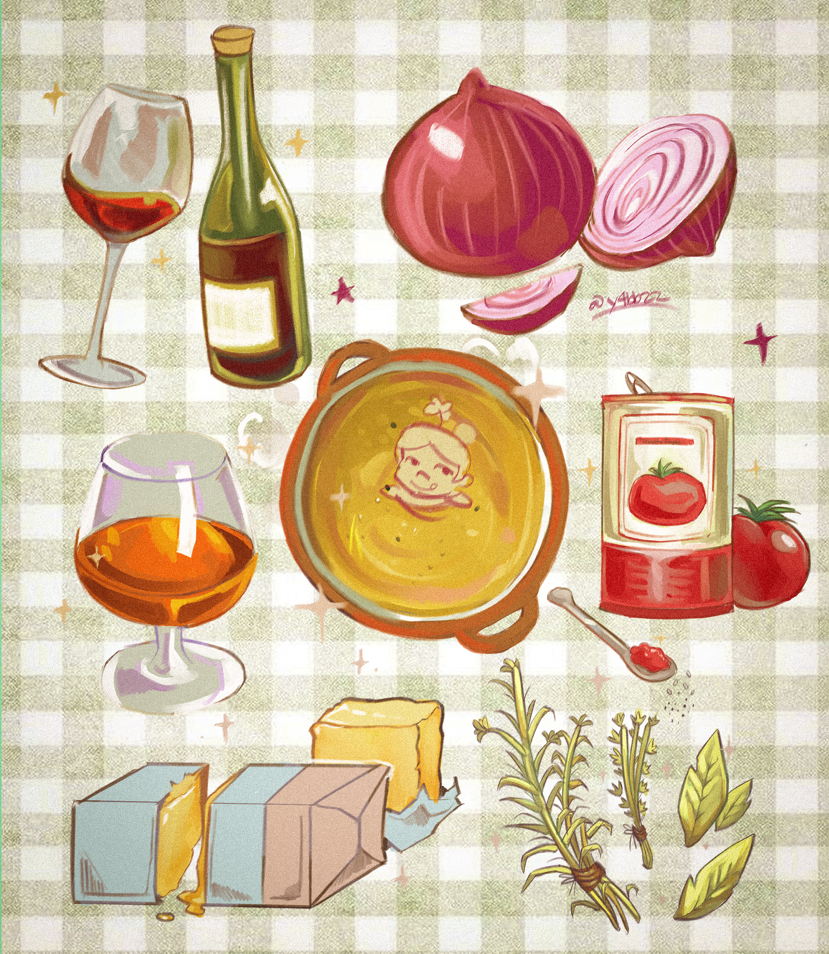
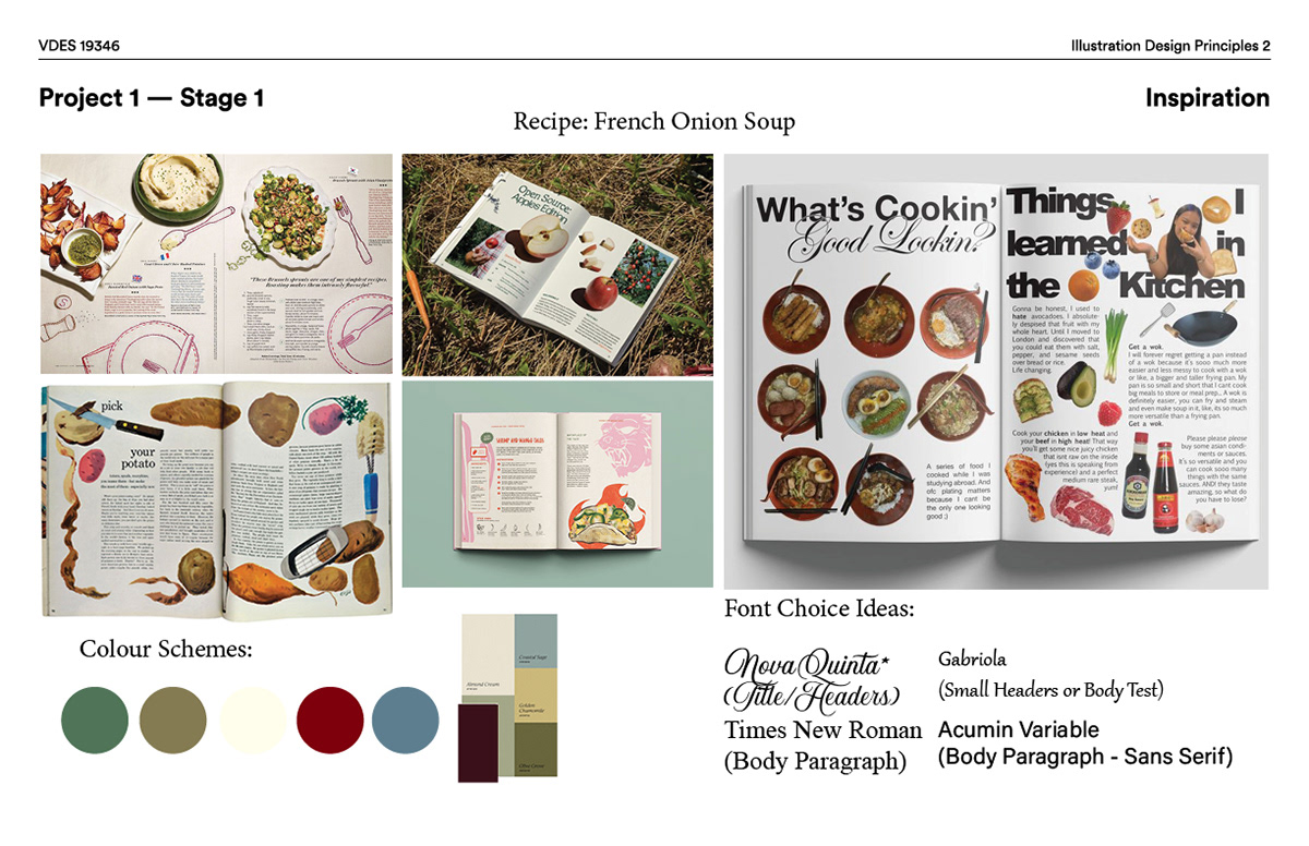
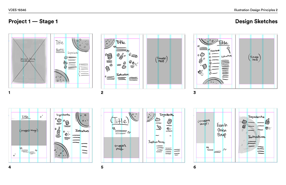
Recipe Spread (2026)
A mockup for a French Onion Soup recipe. Utilizing Indesign and creating ingredients icons to create the final spread, I aimed to create an illustrative recipe with whimsical elements with rustic influences!
More Designs and Experiments